Data Visualisation with Microsoft Excel
13th Dec 2022 09:30 am - 04:15 pm
Venue: Virtual Delivery
Paid
26th Sep 2022
Event Description
Aims and Objectives
This course is designed to introduce existing users of Microsoft Excel to the Principles of Data Visualisation using Microsoft Excel Charts.
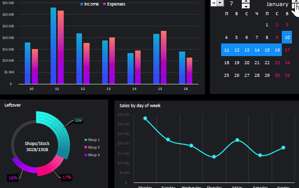
By the end of this course, delegates should be comfortable with applying Data Visualisation principles to create pleasing and informative Dashboards using Chart Options and Chart Design in Excel. You will gain an understanding of how to choose the best chart for your dataset and how your dashboard can tell a story to your audience. As a Consolidation Task at the end of the day, you will learn how to present your charts in an Excel Dashboard and export into PowerPoint based on the knowledge you have gained during the course.
Duration
1 Day
Format
- Classroom / Virtual based;
- Trainer led. Interactive with opportunity for questions and discussion.
Audience
- People who have a good knowledge and understanding of MS Excel and who wish to learn some of the Visualisation features.
Pre-requisites
- A working knowledge of Excel
- No prior knowledge of creating charts is required
- An understanding of the need to process your information visually
- An understanding of the use of large datasets
Course Content
Data Visualisation Key Principles
- Learning Data Visualisation Best Practice
- Choosing the Best Chart Type for your Data and Audience
Chart Types & Secondary Axis
- Comparison Charts
- Correlation Charts
- Distribution Charts
- Composition Charts
- Combo Charts with Secondary Axis
Chart Elements
- Manipulating Chart Elements to emphasis your Visual Story
- Best use of Titles, Labels and Gridlines
- Trendlines, Axis & Legend Options
- Choosing Design and Colour Schemes
- Alignment and Positioning Techniques
- Number and Series Formatting
Chart Data
- Choosing Data Series
- Changing Data Source & Chart Type
- Moving and Positioning Charts
Preparing Data for Analysis
- Importing data to Excel for analysis
- Removing Duplicates and Blank rows
- Use Find and Replace to Cleanse Data
- Split Columns using a delimiter or fixed width
- Using Text Functions
- Formatting Dates
- Paste Special
Pivot Tables and Pivot Charts
- Summarising Large Datasets using Pivot Tables
- Fields, Row & Column Headings, Values
- Filters and Slicers
- Refreshing Data
- Creating a Pivot Chart from Summarised Data
Creating a Visual Dashboard
- Create a pleasing visual dashboard in Excel
- Remove Gridlines and Sheet Options
Exporting Charts to PowerPoint
- Exporting Visualisations to PowerPoint
Contact Pauline Thompson on Pauline.Thompson@APSlearning.co.uk or 07767 392003 for further details.
Register for Event